
The Synthetic Control Method#
Uber wants to know whether a new driver-incentive program — a weekly earnings guarantee — increases completed rides. But the program can’t be tested as a driver-level randomized experiment within a city: drivers compete for the same rides in the same marketplace, so incentivizing a subset changes wait times and completion rates for everyone, treated or not. The platform ends up launching the program city-wide, in a single city — Austin. What is the counterfactual for “Austin without the program”?
This section presents the synthetic control method, the standard tool for causal inference when treatment hits one (or a few) large aggregate units and individual-level randomization is infeasible or invalid. We will build, step by step and using the same Uber/Austin scenario throughout, a credible counterfactual from a weighted combination of other cities; formalize the conditions under which that counterfactual has bounded bias; and develop a form of statistical inference that does not rely on a large random sample.
1. Objectives#
By the end of this section, the reader will be able to:
Explain why treatment at the level of large aggregate units, combined with marketplace interference, calls for a counterfactual built from multiple comparison units rather than a single one.
Construct a synthetic control: define the donor pool, the predictor matrix, and the weight vector \(W\), subject to its nonnegativity and sum-to-one constraints.
Evaluate pre-treatment fit (RMSPE and weight sparsity) as the central diagnostic before interpreting any post-treatment gap as a causal effect.
State the bias bound under a factor model and explain why it depends, conditionally, on pre-treatment fit — not on the number of pre-periods \(T_0\) alone.
Conduct permutation inference: compute \(r_j\) for every unit, derive a rank-based p-value, and explain why units with poor pre-treatment fit must be excluded from the comparison.
2. The Problem: Few Aggregate Units and Marketplace Interference#
The obstacle isn’t just that Uber chose to launch the program in a single city — it’s that it couldn’t have done otherwise. On a two-sided platform, incentivizing some Austin drivers to log more hours changes the available supply for every rider in Austin, so the outcomes of non-incentivized drivers are affected too. This is exactly the no-interference violation (SUTVA) we ran into when studying randomized experiments: one unit’s potential outcome cannot depend on another unit’s treatment assignment. Randomizing within Austin, at the driver level, would invalidate the experiment through marketplace spillovers.
So the treatment has to be applied to the whole city. And with that, the problem stops being “how do we randomize?” and becomes “what do we compare a single treated city against?” The naive answer is to pick another Uber city that looks like Austin and use it as the comparison — but as we already saw with differences-in-differences, finding a single comparison unit that is genuinely similar is usually hard, if not impossible. Dashboard 1 shows, right away, why that answer almost never holds up.
Before looking at the result, let’s define what we’re after: a credible “Austin without the program” is one that closely reproduces Austin’s pre-treatment trajectory in completed rides. If the candidate counterfactual can’t even match what we already know happened before treatment, there’s no reason to trust what it says about what would have happened after.
Dashboard 1 fixes the rest of the problem so you can focus on this one decision alone: the donor pool is always the same 18 mid-size cities in Uber’s network, and the predictors used to compare cities are always the same (population, income, active drivers, Lyft market share, and pre-treatment rides at four reference weeks). The only thing that changes is how you combine those 18 cities to build the counterfactual. Before exploring:
Start in “Single city” mode. Here the dashboard automatically picks the city with the most similar trend to Austin as the counterfactual, using the RMSPE (the root-mean-squared prediction error between Austin and the comparison, over the 20 weeks before launch) — the data table above the controls shows you which city was picked and why it looks like Austin on paper.
Switch to “Simple average” (every donor city weighted \(1/18\)) and compare the fit. Does it improve or worsen relative to the single city?
Switch to “Optimized synthetic” and watch two things at once: pre-treatment fit improves, and the weight chart stops being uniformly spread out — it concentrates on a handful of donor cities.
What do we observe? The best-matched single city — the one minimizing pre-treatment RMSPE among the 18 candidates — still leaves a visible gap across several of the 20 pre-launch weeks. The simple average is, almost always, worse still: averaging in every city in the panel dilutes the resemblance to Austin, folding in cities that don’t look like it at all. The optimized synthetic control, by contrast, achieves a near-exact pre-treatment fit — and does so leaning on only 3 or 4 donor cities, not all 18. The balance table (Austin vs. simple-average vs. weighted-synthetic, for every predictor) makes visible why: the synthetic’s weighted column sits much closer to Austin’s column than the simple-average column does, row by row.
This points to a central idea of the method, which we formalize next: pre-treatment fit isn’t a cosmetic detail — it’s the evidence that the counterfactual is credible, and it’s achieved by letting the weights concentrate where the resemblance is real, not by forcing them to spread out equally.
3. Constructing the Synthetic Control: Weights and Predictors#
Let’s formalize what Dashboard 1 just showed.
Units and data. We have \(J+1\) units — in our example, Austin plus 18 donor cities (\(J=18\)) — observed over \(T\) periods, of which the first \(T_0=20\) are pre-treatment (in the dashboard, \(T=32\): 20 pre-launch weeks plus 12 post-launch weeks). Unit \(j=1\) (Austin) receives the treatment; the donor pool \(j=2,\dots,J+1\) does not. Each unit has a vector of \(k\) predictors \(X_j\) — 8 in total in the dashboard: 4 demographic variables (population, income, active drivers, Lyft share) plus 4 lagged ride observations (weeks 5, 10, 15, and 20). We stack the donor pool’s predictors in the matrix \(X_0\) (\(k\times J\)) and Austin’s in the vector \(X_1\) (\(k\times 1\)).
Potential outcomes and the estimator. Let \(Y_{jt}^N\) be the outcome we’d observe without the program, and \(Y_{1t}^I\) Austin’s outcome under the program, for \(t>T_0\). The synthetic control defines a weight vector \(W=(w_2,\dots,w_{J+1})'\) and estimates Austin’s unobserved counterfactual as a weighted combination of the donors:
and the estimated causal effect in each post-treatment period as
The constraint that sets the method apart. The weights are restricted to be nonnegative and sum to one: \(w_j \geq 0\), \(\sum_j w_j = 1\). This constraint is what makes the “synthetic” in the method literally a weighted average of real cities — never an extrapolation outside the range of observed data. Contrast this with an unconstrained regression, where coefficients can take any sign and magnitude: a regression could “invent” a synthetic Austin with more drivers than the largest city in the donor pool, simply by extrapolating. The synthetic control can’t do that — its counterfactual always lives inside the convex hull of the donor cities.
How the weights are chosen. \(W^*\) is chosen to minimize the distance between Austin’s predictors and the weighted donor pool’s:
where \(v_h \geq 0\) weights the relative importance of predictor \(h\) in the distance. Dashboard 1 uses the “simple selector”: it sets \(v_h\) as the inverse of predictor \(h\)’s sample variance across the 19 cities — equivalent to standardizing every predictor before measuring distances, so that no predictor dominates just by being on a larger scale (population in millions vs. market share in percentage points, say). A more rigorous approach, implemented in packages like scpi, chooses \(V\) by minimizing out-of-sample prediction error: split the pre-treatment periods into a training stretch and a validation stretch, compute the weights using only the training stretch, and pick the \(V\) that minimizes squared prediction error on the validation stretch. This cross-validation procedure has an extra benefit — it also serves to compare predictor sets against each other — but it requires enough pre-treatment periods to split meaningfully into two stretches.
With \(W^*\) solved, Dashboard 1’s weight chart is the visual face of this optimization: under “single city,” all the weight falls on one bar; under “simple average,” all 18 bars are the same height (\(1/18\)); under “optimized synthetic,” a handful of bars rise clearly above the rest — weight sparsity isn’t a side effect, it’s the signature of the algorithm having found a subset of cities genuinely similar to Austin, rather than averaging indiscriminately.
4. A Classic Case Study: Proposition 99 in California#
The Uber/Austin scenario stays with us throughout this section because it’s the thread we’ve been building since RCTs and instrumental variables. But it’s worth pausing on the study that introduced the method in the literature: Abadie et al. [2010], on Proposition 99, California’s 1988 tobacco-control law that raised the cigarette tax by 25 cents per pack.
The authors build a synthetic control for California from a panel of 38 other states that did not adopt comparable tobacco controls, using lagged cigarette consumption and demographic and price variables as predictors. The result reproduces, with real data, exactly the pattern we saw in Dashboard 1: pre-treatment fit is close and the weights are sparse.
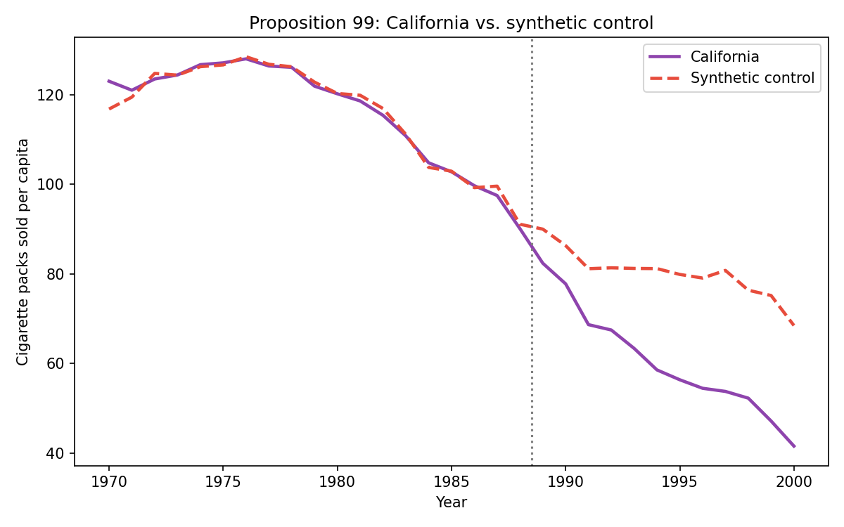
The synthetic control (dashed line) closely tracks California’s actual consumption (solid line) over the 19 years before 1988, and the trajectories then diverge sharply after the law.
Data and figure recreated from Abadie, Diamond & Hainmueller (2010).
California’s synthetic control draws almost all its weight from just six donor states: Utah (0.39), Montana (0.27), Nevada (0.19), Connecticut (0.08), New Hampshire (0.05), and Colorado (0.03) — the rest of the weight is essentially zero. The pre-treatment RMSPE is 1.70 packs per capita, and by 2000 the gap between California and its synthetic control reaches nearly 27 fewer packs per capita — consistent with the law’s effect.
An additional figure from Abadie et al. [2010]’s own paper illustrates something we take up formally in Section 6: applying the same estimation procedure to every state in the donor pool, as if each had received the treatment, shows some states producing post-treatment gaps just as large as California’s — but only because their synthetic control never achieved good pre-treatment fit in the first place.
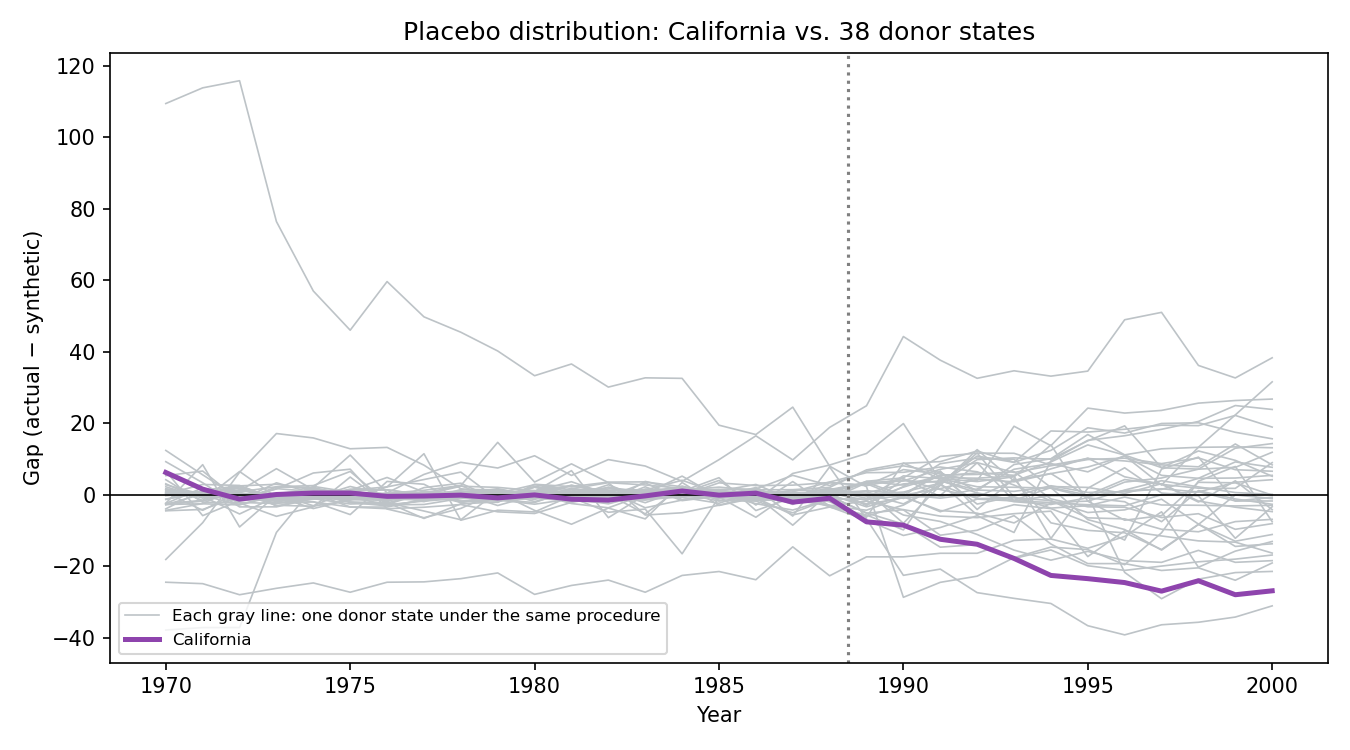
Each gray line is a donor state’s gap (actual − synthetic) under the same procedure applied to California (purple line). Several states produce large gaps in the post-treatment period — Section 6 formalizes why they don’t all count equally.
Data and figure recreated from Abadie, Diamond & Hainmueller (2010).
This is a historical anchor, not a new example to follow going forward: the running thread of this section remains Uber and Austin. But it’s worth flagging honestly a nuance the code notebook explores in detail: unlike the simulated version in Dashboard 3, where excluding poor-fit donors does sharpen the p-value, in the real Proposition 99 data the two states ranked above California (Missouri and Virginia) actually have better pre-treatment fit than California itself. No fit-quality cutoff excludes them, so the permutation p-value stays around 0.08–0.10 rather than approaching the ~0.026 the original paper reports under other exclusion criteria. Real data doesn’t always behave as cleanly as a simulation designed to illustrate a mechanism — and that’s a useful lesson in itself.
5. The Bias Bound Under a Factor Model#
A close pre-treatment fit is necessary, but not automatically sufficient. A synthetic control can look a lot like Austin in the pre-treatment period and still produce a biased estimate of the effect — if that resemblance was achieved by chance, or if it’s capturing the wrong things. This section formalizes when good fit does imply low bias, and when it doesn’t.
Dashboard 2 isolates exactly this question. Unlike Dashboard 1 — where donor-pool quality was entirely observable in the demographic data — here we introduce, for the first time, an unobserved factor \(\mu_j\) that also determines each city’s outcome. This lets us separate two notions that are often conflated: “the visible fit looks good” and “the bias is actually low.” Before exploring:
Set
fit_qualityto “Good fit” and sweep \(T_0\) from 5 to 50 weeks: mean absolute bias shrinks as \(T_0\) grows.Switch to “Poor fit” and repeat the \(T_0\) sweep: the mean-bias curve stays flat and elevated, no matter how many pre-treatment periods you add.
Compare the worst case (high transitory-shock scale + \(T_0=5\)) against the best case (low scale + good fit + \(T_0=50\)) to see the full range.
What do we observe? The top panel (“One Realization”) already shows the difference at a glance: under poor fit, Austin’s path and its synthetic control diverge even before treatment, while the 18 donor cities traced in gray in the background show the problem isn’t a lack of data — it’s that no combination of those cities can replicate Austin. The bias histogram, and especially the centerpiece line plot of mean bias vs. \(T_0\), confirm the pattern: under good fit, more pre-treatment periods do reduce bias, because each additional period is one more opportunity for a “lucky” fit to reveal itself as such. Under poor fit, adding periods doesn’t help at all — the bias isn’t coming from sampling noise that averages out with more data, it’s coming from the counterfactual being misspecified from the start.
Formal result. Consider the factor model proposed by Abadie et al. [2010]:
where \(\delta_t\) is a common time factor, \(\theta_t\) are time-varying coefficients on observed predictors \(Z_j\), \(\lambda_t\) is a vector of unobserved common factors with unit-specific loadings \(\mu_j\), and \(\varepsilon_{jt}\) is idiosyncratic transitory noise. (If \(\lambda_t\) were constant over time, this model collapses to DiD with parallel trends; by letting \(\lambda_t\) vary, the factor model is strictly more general.)
Under the condition that the synthetic control exactly reproduces Austin’s observed predictors, \(X_1 = X_0 W^*\):
Formal result: the bias of \(\hat\tau_{1t}\) is bounded by an expression that depends on the ratio between the scale of the transitory noise \(\varepsilon_{jt}\) and the number of pre-treatment periods \(T_0\).
The intuition: if \(X_1=X_0W^*\), the synthetic control matches the observed part \(Z_1\), but it cannot directly match \(\mu_1\), which is unobservable. A synthetic control that fits \(Z_1\) but not \(\mu_1\) can only achieve a good pre-treatment fit if the transitory noise \(\varepsilon_{jt}\) happens to offset the mismatch in \(\mu_j\) — simultaneously, in every one of the \(T_0\) periods. The more periods that would have to “line up by luck” to sustain that fit, the less plausible it is that it’s pure chance — which is why the bias bound depends inversely on \(T_0\). The formal proof is in the appendix.
The crucial caveat. Abadie et al. [2010] are explicit about not over-reading this result as \(T_0\to\infty\): bias can persist no matter how many pre-treatment periods we add, unless the fit quality \(X_1 - X_0 W^*\) is genuinely good. The bound is derived conditional on achieving that fit — it does not guarantee the fit improves, or even exists, just because \(T_0\) is large. This is exactly what Dashboard 2 makes visible: the “poor fit” curve never converges to zero, no matter how large \(T_0\) gets.
6. Permutation Inference#
Even an estimate with good fit and bounded bias needs an answer to: is this post-treatment gap large compared to what we’d see from idiosyncratic variation across cities, with no real effect at all? With \(J+1\) aggregate units — not a large sample of individuals — there’s no natural sampling distribution to lean on for a conventional standard error. Synthetic control resolves this with permutation inference.
Dashboard 3 implements the full procedure: it reassigns “treatment” to each of the 18 donor cities in turn, recomputing the synthetic control for each as if it were the treated unit, and compares Austin’s result against this distribution of “placebo” results. Before exploring:
Set the fit filter (
fit_cutoff) to “Keep all” and watch how poor-fit placebos — with large, uninformative gaps — dilute the ranking.Tighten the filter to “3×” or “5×” and check the table of excluded cities: the p-value sharpens as donors that never fit well pre-treatment get filtered out.
Toggle
true_effectbetween 0% (to check calibration: Austin’s statistic should look unremarkable within the placebo distribution) and 15% (to check power: Austin’s statistic should sit near the extreme).
What do we observe? The top line chart shows all 19 gap trajectories (actual − synthetic): Austin highlighted, donors excluded by the current filter in faint gray, and kept donors in darker gray. With the filter set to “keep all,” several donor cities never achieved good pre-treatment fit — their “placebo gap” is large simply because their synthetic control never represented them well, not because there’s a real effect. Including them in the comparison dilutes the significance of Austin’s result. As the filter tightens, those cities drop out of the comparison and the p-value moves — lower when true_effect is positive, staying near what we’d expect under chance when true_effect is zero.
Formalization. For every unit \(j\) (Austin and each donor, treated as a placebo), define:
the ratio between post-treatment and pre-treatment fit error. This is the correct statistic — not the raw post-treatment gap — precisely because it normalizes for each unit’s fit quality: a unit whose synthetic control never fit well pre-treatment will already have a large pre-treatment RMSPE, so its \(r_j\) doesn’t spike even though its post-treatment gap is also large for the same structural reason. The rank-based permutation p-value is
the share of units (Austin included) whose \(r_j\) is at least as large as Austin’s, among the \(J'+1\) units that survive the fit-quality filter. This is exactly the logic Dashboard 3’s fit_cutoff control puts in your hands: deciding how strict the criterion is for “this unit could plausibly have been compared to Austin” before building the ranking.
💻 How to Estimate in Code
The dashboard above runs permutation inference on the simulated Austin scenario. The same code notebook from the previous section also implements this leave-one-out permutation procedure — the same \(r_j\) calculation and the same rank-based p-value — first on the Austin scenario, and then on the real Proposition 99 data, reproducing Abadie et al. [2010]’s classic placebo distribution. It also shows, as an explicit contrast rather than a replacement, scpi_pkg’s prediction-interval inference — a materially different simulation/conformal-based approach to the classic permutation p-value.
7. Summary and Decision Tree#
Before reporting a synthetic control result, it’s worth working through the following questions in order:
Does treatment hit one (or a few) large aggregate units, with many potential untreated comparators? If instead you have many units treated at different times, staggered DiD is usually the more natural tool; if you have exogenous variation in treatment at the individual level, think instrumental variables.
Is there a donor pool that can achieve good pre-treatment fit? If no subset of donors comes reasonably close to the treated unit’s predictors, Abadie et al. [2010] are explicit: don’t use synthetic control here — the risk of substantial bias is too high.
Are there enough pre-treatment periods relative to the expected idiosyncratic noise? This determines how much you can trust that the bias bound actually shrinks with \(T_0\), rather than staying flat as in Dashboard 2’s poor-fit case.
Does the permutation p-value survive a reasonable fit-quality filter among the placebos? A p-value computed including donors that never fit well pre-treatment isn’t comparable to one that excludes them — as we saw in Dashboard 3 and, with some nuance, in the Proposition 99 case itself.
Beyond these four questions, standard practice includes two further robustness checks that don’t yet have their own dashboard in this section, but are worth mentioning as good practice: an in-time placebo (artificially move up the intervention date and verify no spurious “effect” appears before the actual launch) and a leave-one-out exercise (drop each donor one at a time and recompute, to verify the result doesn’t hinge disproportionately on a single city). An in-time placebo that does show an effect suggests the model is picking up something other than the treatment — perhaps anticipation, perhaps an omitted shock. An unstable leave-one-out result suggests a single donor is carrying an outsized share of the identification.
Synthetic control completes this chapter’s quasi-experimental toolkit. Against DiD, which averages over many treated and control units to estimate an aggregate effect, synthetic control is designed for the opposite case: one (or a few) treated units, with all the identification work placed on building a credible counterfactual from the untreated units available. Against instrumental variables, which exploits individual-level exogenous variation when a valid instrument exists, synthetic control needs no instrument at all — but requires, in exchange, a donor pool capable of achieving genuinely good pre-treatment fit. Choosing among these tools is, above all, a matter of choosing which one best describes the treatment-assignment structure you’re actually facing.
Appendix: Formal Derivations#
A.1 The Weight-Selection Problem as Constrained Least Squares#
Setup. We seek \(W=(w_2,\dots,w_{J+1})'\) solving
This is a generalized least squares problem with two additional linear constraints on \(W\).
Step 1 — Without constraints, this would be a regression. If we drop both constraints (\(w_j\geq0\) and \(\sum w_j=1\)), the problem reduces to a linear regression of \(X_1\) on the columns of \(X_0\), weighted by \(V=\text{diag}(v_1,\dots,v_k)\): the generalized least squares solution \(W_{\text{GLS}} = (X_0'VX_0)^{-1}X_0'VX_1\). Nothing prevents some \(w_j\) from being negative or greater than one — the regression can “extrapolate”: construct a combination with more population, or less income, than any individual donor, whenever that minimizes the weighted distance.
Step 2 — The constraint \(\sum_j w_j=1\) anchors the scale. This constraint ensures that if \(X_1\) and every column of \(X_0\) shift by a common additive constant, the solution doesn’t change arbitrarily — the synthetic control inherits the donors’ weighted average predictor level, rather than an arbitrary level that depends on the chosen measurement origin.
Step 3 — The constraint \(w_j\geq0\) anchors the combination inside the convex hull. Combined with \(\sum_j w_j=1\), this constraint implies that \(X_0W\) is always a weighted average of the columns of \(X_0\) — geometrically, a point inside the convex hull of the donors in predictor space. No \(\hat{Y}_{1t}^N\) can fall outside the range of values observed in the donor pool. This is the key structural difference from an unconstrained regression, which can extrapolate outside that range.
Conclusion. The synthetic control’s weight-selection problem is a regression with added nonnegativity and sum-to-one constraints; these two constraints are precisely what turn the “synthetic” into an interpolated — never extrapolated — weighted average of real donor units.
A.2 Sketch of the Bias Bound Under the Factor Model#
Setup. Under the factor model \(Y_{jt}^N = \delta_t + \theta_t Z_j + \lambda_t \mu_j + \varepsilon_{jt}\), and assuming the synthetic control exactly reproduces the treated unit’s observed predictors, \(X_1 = X_0W^*\) (where \(X_1, X_0\) include \(Z_j\) and, typically, pre-treatment outcomes).
Step 1 — Decompose the bias. The bias of \(\hat\tau_{1t} = Y_{1t} - \sum_j w_j^* Y_{jt}\) relative to the true effect can be written, substituting the factor model, as a function of three pieces: the difference in the common time factor \(\delta_t\) (which cancels because it is common to all units and \(\sum_j w_j^*=1\)), the difference in the observed component \(\theta_t(Z_1 - Z_0W^*)\) (which vanishes under \(X_1=X_0W^*\), on the part of \(X\) corresponding to \(Z\)), and two terms that don’t cancel automatically: \(\lambda_t(\mu_1 - \mu_0'W^*)\) — the mismatch in the unobserved factor — and \(\varepsilon_{1t} - \varepsilon_0'W^*\) — the transitory noise.
Step 2 — Why \(\varepsilon\) and \(T_0\) enter the bound. The mismatch in the unobserved factor, \(\mu_1 - \mu_0'W^*\), cannot be eliminated by choosing \(W^*\) because \(\mu_j\) is unobservable — it doesn’t enter \(X_1, X_0\). But if the pre-treatment fit \(X_1\approx X_0W^*\) was achieved exactly, that could only have happened because, in every one of the \(T_0\) pre-treatment periods, the transitory noise \(\varepsilon_{jt}\) happened to offset that mismatch in \(\mu_j\) enough for the observed predictors to line up. The probability that \(\varepsilon_{jt}\) consistently offsets the same structural mismatch in \(\mu_j\) across more and more periods (growing \(T_0\)) decays — which is why the bias bound depends on the ratio between the scale of \(\varepsilon_{jt}\) and \(T_0\).
Step 3 — Why the bound is conditional, not unconditional. The entire argument in Step 2 starts from assuming \(X_1=X_0W^*\) exactly. If that condition fails — if the donor pool simply cannot replicate the treated unit’s observed predictors — the term \(\lambda_t(\mu_1-\mu_0'W^*)\) need not shrink with \(T_0\), and the bias can remain large no matter how many pre-treatment periods are added. This is exactly what Abadie et al. [2010] warn against: the bound is derived conditional on achieving good fit; it is not a guarantee that such fit exists or improves as \(T_0\to\infty\).
Conclusion. The bias of the synthetic control, under the factor model and conditional on an exact pre-treatment fit, is controlled by the ratio between the scale of the transitory noise and \(T_0\) — but that conditionality is the central warning of the result, not a footnote: without good fit, adding pre-treatment periods does not repair the bias.
Test what you learned#
References#
The interactive dashboards in this section also draw on Abadie [2021], in addition to Abadie et al. [2010].
Alberto Abadie. Using synthetic controls: feasibility, data requirements, and methodological aspects. Journal of Economic Literature, 59(2):391–425, 2021.